“Home Runs by Park – 2011 Season” or “Man the Astros Sucked This Year”

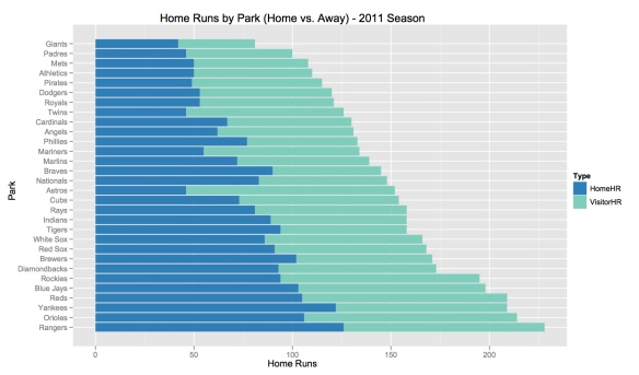
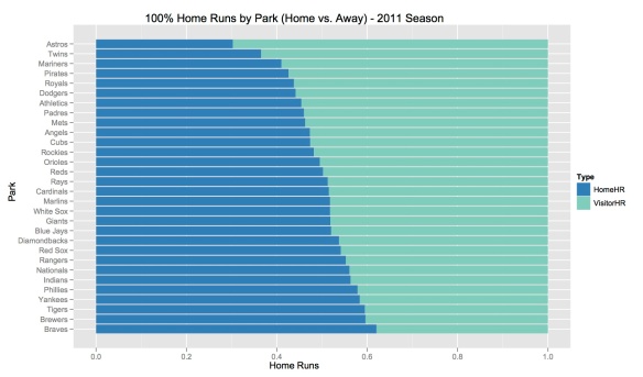
I hate the Giants. Let this be known. What i was hoping to find was another reason to support my claim that their WS win in 2010 was a complete fluke.  So when digging through the game logs for the 2011 season from Retrosheet I noticed that the park with the fewest home runs for the whole season was AT&T Park.  Boom!  Giants suck right? I’ve seen little league teams with a higher team ISO!  HA! Except i’m just smart enough to know that before I proclaim my findings I should probably dig just a little deeper. So the next step was to break down the total number of home runs by Home Team vs. Visiting Team. My victory was short lived. It turns out that the Giants, as a team, had 42 home runs on the season at AT&T Park to the visiting teams 39.  Just better than 50/50. Fine! So the question then was who was the worst team by this completely arbitrary and new metric that I can’t think of a clever name for right now but am open to suggestions…The answer was the Houston Astros.  They miserable 2011 Astros hit 46 home runs in their own park (more than the Giants I might add) and gave up 106 to all visiting teams.  %30.26 of the balls that left Minute Maid Park were hit by the home team.  Painful if you’re an Astros fan. And even worse knowing that in 2 years that place is going to be full of American League teams. The winner of this game for the 2011 season is the Atlanta Braves with %62.07 of Home Runs at Turner Field coming off of native bats.

The charts below were made using ggplot2 and retrosheet game logs:

This One’s Personal: Sanford Koufax vs. Randy Johnson…pffft

I couldn’t let this one go. The conclusion draw here by this author that Randy Johnson was “the best pitcher of all time” was not something I could allow to slip through the cracks. Johnson was awesome. Incredible to watch. Always delivered on a great game without a doubt. But by all measures not the greatest pitcher of all time AND not even the greatest left-handed pitcher of all time. Any reasonable person knows that this distinction belongs to Sandy Koufax. The problem, that we all know, is that Koufax’s career was cut short because he was playing at a time when no one was limiting young pitchers the way the do now in order to save their arms to lengthen their careers.  He left at the height of his game, and, if you watch his press conference when he made the decision it’s quite understandable.

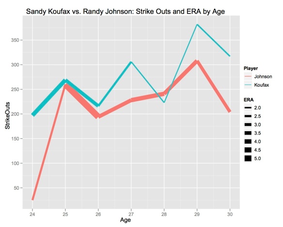
So then how do we judge a 21 year major league career against a 12 year career.  I propose two methods of doing so.  We can compare their seasons by Age which creates a bit of an issue because Koufax was forced to join the team at 19 because of some rules around how he was drafted that don’t exist anymore and Johnson didn’t come up to the majors until he was 24.  So this limits us to 7 seasons: Ages 24-30.  The other way to approach it is to compare their stats by career year which will give us 12 years to look at keeping in mind that Johnson had considerably more time to hone his skills in the minors.

The charts below are using the ggplo2 R package with no doctoring of the images. I’ve also kept it strictly to the stats used in the above mentioned post: Strike Outs and ERA. While the XY-aspect of the plot should be obvious (Strike Outs against Age or Career Year), the thickness of the lines also represents their respective ERAs.  Lets see how this compares first by Age then by Career Year.

By age Koufax is the clear winner.  He had more time in the majors than Randy at that point but the point of being in the minors is to get prepared for major league baseball. That begs the question then if minor league experience is better than just being dumped right in? By career year I’d say that on first glance it looks pretty even but when you look closer at all of Sandy’s sub-3 and sub-2 ERA seasons plus his huge number of strikeouts in his year 11 season I’m also going to go ahead and give this one to Sanford.

One of the things Johnson is so lauded for is his high number of cumulative strike outs.  So let’s do the same thing.  First by Age then by Career Year:

I don’t even have to comment this.  Koufax = Winner.  The question is always out there about what could he have done if he hadn’t blown out his arm.  We’ll never know.  But just because he didn’t get to put up the cumulative numbers that some players have doesn’t mean he should be excluded from the “Greatest Pitcher Ever’ or ‘Greatest Left Hander Ever’ debates.

Home Runs heating up?

My intuition tells me that objects traveling through the air would meet more resistance when there is more moisture in the air. It turns out that my intuition is wrong. It still doesn’t make sense to me but apparently humid air is less dense. And this applies to baseball specifically because the belief is that there are more home runs in the latter half of the season because many parks are in humid areas (east coast bias) and as the summer progresses it gets hotter and hotter and more and more humid. A lot of this is purely anecdotal: “The ball’s really going to start flying out of the park as the weather heats up” and other such nonsense from the mouths of the talking heads we’re forced to listen to while watching a game.

Anyway, after seeing this post at Revolution Analytics I wanted to use the calendar heat map function created by Paul Bleicher.  (source code is available here) And it seemed like a really fitting opportunity to look at how cumulative daily home runs fluctuated over the course of the MLB season. Based on the science behind the humidity factor you would imagine that there would be a, somewhat, obvious increasing trend at least until it starts to cool off at the end of September. Here is how that data looks in one of these calendar heat maps.

From this perspective I’m seeing home run heavy days sprinkled all over the course of the season. The only conclusion that I can come to is that 1) obviously the science is right but the sample size is too small on a daily basis not to be skewed by one big game and 2) the announcers that perpetuate these myths are just parroting each other with no actual check on what comes out of their pie-holes.

Show me your WAR face!

Below is a chart of the top 20 offensive players based on FanGraphs WAR for the 2011 season.  The various features and their corresponding metric are clear in the image. I’ve also included the leader and last place for each metric to get an idea of what the extremes would look like as it’s all normalized.  For example Jose Reyes’s 7 Home Runs this season gives him a very narrow face as compared to Jose Bautista’s double wide.  (This is highly derivative and I’m painfully aware of this but I really wanted to play with the Chernoff faces function available in the aplpack R library. )

How does Matt kemp become Andre Dawson?

While reading this article over at Fangraphs I was inspired to ask myself “what would Matt Kemp have to do between now and then end of his career to be seriously considered for the Hall of Fame?”.  This question comes out of

1) Being a Dodger fan

and

2) Romanticizing the idea of watching a HoF player’s entire career develop from beginning to end.

Assuming what the author of the above mentioned Fangraphs article assumes, that Andre Dawson is the baseline for the HoF and reducing it to the simplest case of cumulative WAR, the question is how much more WAR does Kemp need to match Dawson?  Well, 49.1 is the answer.  Matt Kemp’s WAR progression is actually pretty interesting in that prior to his terrible 2010 season he was improving at a rate that fits a simple regression line with an R-squared of 0.997.  That’s right, he was moving along in almost exactly a straight line.  But what is even more interesting is that even with his dip in 2010 he actually hopped right back on that regression line in 2011, as if 2010 had never happened (actually if you exclude 2010 then the R-squared drops all the way down to 0.977).  He actually improved 2 seasons worth in that time.  Assuming that he continues on that same line, which is totally reasonable as most HoF-ers have at least one 10+ WAR season, then he will be at 10.2 WAR and his first seven seasons as compared to Dawson’s will look like the following:

As you can see Andrew Dawson really shined as a rookie (hence the RoY award) and Matt Kemp’s 2010 season is really going to hurt him in cumulative WAR.  It isn’t impossible for him to catch up at this point but he will have to have a string of really stellar seasons and/or quit before he gets too old and into that negative WAR territory.

Below is a look at some key offensive statistics of the two players over their first six seasons.

A discussion of whether or not a player with only 6 major league seasons under his belt is HoF worthy is obviously quite premature.  And HoF voting is largely subjective and not based on standardized metrics like WAR.  Nevertheless, with the season that we saw from a player with absolutely no protection in his line up, driving in 126 runs with something like 127 runners on base ahead of him all season I don’t think this is too far out of the realm of possibilities.